First rule of magic: Don’t let anyone know your real name. Names have power.1
Microcopy isn’t usually at the top of the list when it comes to developing interfaces — button text is usually straightforward when it comes to the nondescript “OK”/“Cancel”, “Confirm” or “Save”. In fact, given the high rate of smartphone penetration, the value of screen real-estate favours use of iconography over text to communicate functionality.
This works when your UI does things that have well-established conventions for, like a 📞 button would call someone when tapped, and a 🗑 button deletes an item. Barring obscure iconography when a front-end developer tries to get cute with their UI implementation (🤷♂️), there comes a point when you actually have to start labelling stuff instead of relying on icons to communicate which button does what.
(alt text only works when your users are using a mouse/trackpad.)
That inflection point, where you start having to label stuff, is when you find that you need a manual to describe how to use your application’s UI.
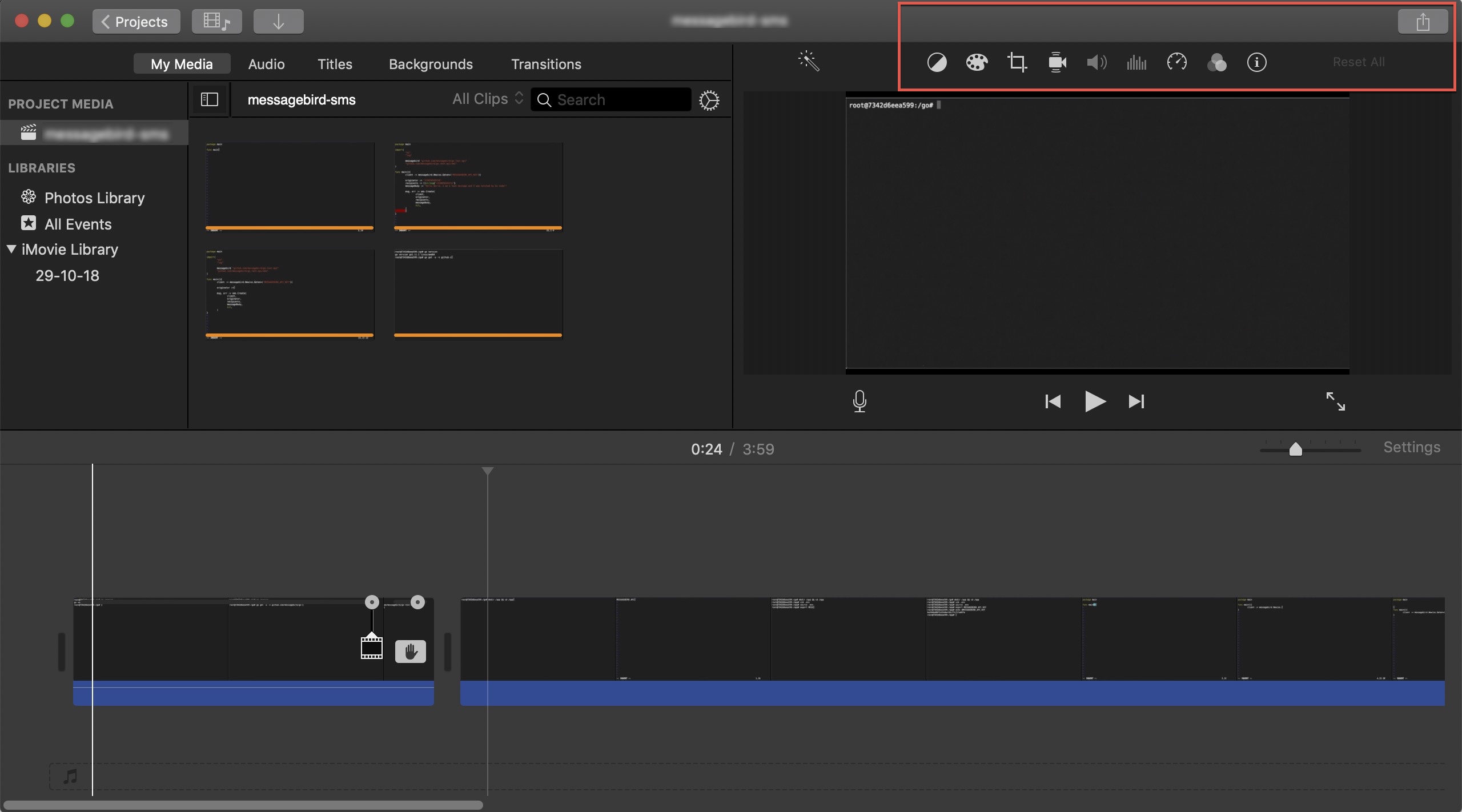
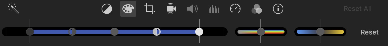
Take iMovie for example: without context, I wouldn’t know what any of the icons at the top right corner of the application does without holding my mouse cursor over each icon. While this is forgivable for a complex application — you can’t expect the UI to deliver beyond what’s basically the physical limit of a display — what I found most annoying about this is that I couldn’t for the life of me figure out how to export my work. The option to save or export has been inexplicably removed from the “File” menu, leaving me fumbling around with the interface trying to get my work into a reasonable format and deliver it to my client. It got more frustrating when I realised that pressing the standard shortcut keys for export (⌘+E) sent me to a screen that said “Theatre”, appeared to export my project, but left me with no way to open its location on my filesystem.
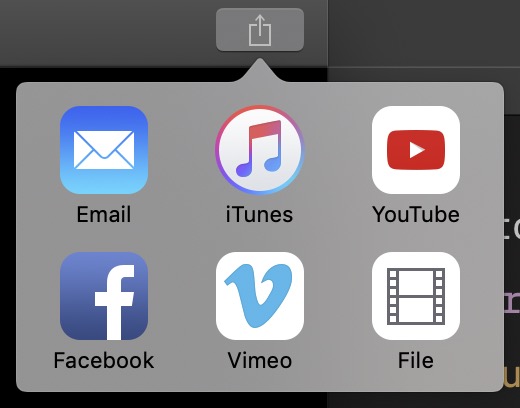
I eventually found that to export a clip without going through the “Theatre”, I had to go to File > Share > File…. But that didn’t export the whole project, but just the first clip of the project. I had to click on the Share button at the top-right corner of the application, and select File to get my whole project exported.
(Note: I realised — two days after my attempt — that I could drag exported projects out of the “Theatre” to any location on my filesystem. But that is horribly unintuitive: nothing in the “Theatre” told me that I could do that. Nothing in the “Theatre” UI showed any affordances for dragging and dropping exported project. This is even worse when you consider that I’ve been using Apple products for eight years and counting, and I’ve worked in UX/UI-related fields for five of those years.)
We can break this down into two fundamental issues:
- Convention was broken. This is an example of how UI design can be too clever — in its push to move its users to a more iCloud-centric paradigm, Apple decided to hide its File export option and instead push users to export to iCloud by default. It’s a textbook example of a dark pattern, and is shameful to see in what is supposed to be top-tier software.
- Mislabelling, or a lack of labels. This is a perennial issue with icon-heavy interfaces — that they assume that all their users know what they mean. In this case, I would not expect a Share button to allow me to export a file to a location on my filesystem. It is possible to argue that Apple is trying to reclaim the otherwise underused “Share” button, which conventionally is used to share data with other people (e.g. through social media applications, email etc.) because sharing is denotationally a social act. It is also possible to argue that, given the above definition of “sharing”, the Finder (and therefore the filesystem itself) is also an application. But you can tell by the mental gymnastics we have to perform that these are not intuitive definitions, which means that we are trying to stretch the meaning of the word — not something we should be doing in a field where reducing cognitive load is so important.
Both these issues point towards a need for clearer labelling and more explicitly functional microcopy — that is to say, buttons and features should be clearly spelt out and and named according to accepted convention.
Share buttons should perform a social function; performing file-related movement of data out of an application should be delegated to an Export button. Similarly, an icon depicting a paint palette should allow me to select from a range of colours (to what effect?), and not produce yet another row of unlabelled bars with barely any colour and expect me to know how to use them.
Labelled UIs are just simpler. It takes a lot of work to get an unlabelled UI to work — and as shown above, even Apple can’t get it right. Yes, more text increases clutter and workflow friction. Yes, text increases cognitive load. Yes, text depends on the user’s ability to understand the written language, and also adds the burden of localisation. But all these things have very clear solutions: if you have too much text in your UI, then you’re putting too many things in one screen — which means you might need to put a bit more work into refining your user flow. If localisation is difficult, then you might have coupled your UI text too tightly with your application code (or even worse, hardcoded these things), which pre-empts the technical debt that comes with it (what happens when you don’t have a spare C++ developer at hand to correct a typo in one popup box?).
And finally: it makes the job of whomever needs to describe your software to another person infinitely easier (it’s not just the technical writers). A labelled interface is easy to refer to, and easy to describe in written text, and verbally over the phone (can you imagine your customer support staff having to describe a hamburger menu button to someone who has neither used one, nor has ever known the taste of an actual burger?).
If there’s anything that you should take away from this post, is that effective technical communication favours the explicit over the implicit. It is always better to spell things out, than to assume that your users will figure it out by themselves. In Gaiman’s The Book of Magic: Invisible Labyrinths, Constantine tells young Tim that giving out their names means giving others power over them. Similarly, explicitly naming a UI element not only allows your user to use it, but also allows your user to more fully grasp it, understand it. The more your user understands your application, the better they’ll get at extracting value from it — which I assume is what you want.
tl;dr: Prefer the explicit over the implicit; name things so they can be grasped (and used).
- John Constantine in The Books of Magic: Invisible Labyrinth, published by DC Comics (1990), written by Neil Gaiman. [return]